Mapping tree crowns for community conservation.
Pipeline walkthrough
8 min

A collaborative ecological mapping register
A unique ID is generated server-side; everything else hangs off it.
Upload one or more GeoTIFFs — select several at once if you have them. Each run uses exactly one, ticked below.
Pick the models and tune the run, then start detection + clustering.
Defaults work well for most surveys. Each field explains what it does below; the ? beside a name opens its full explanation.
Set your chosen k and species names — the cluster table fills in automatically. Assign a species to each cluster, then submit.
Leave a cluster as unlabelled to exclude its crowns from the final species map.
Assign species, validate (if ground truth was provided), and write the KMZ + CSVs.
How to run a survey, and what every setting does.
Five steps. The default settings are fine for a first run. The one thing you must do yourself is name the groups in step 4.
Anything you will recognise later, like "North block, June survey".
A GeoTIFF (.tif) from your survey, or paste a Google Drive link. Large files take a few minutes.
The tool outlines every tree crown and sorts the crowns into groups that look alike. A large survey can take tens of minutes; you can close the tab and come back.
Look at the sample crowns shown for each group and choose the species you recognise.
You get a map file you can open in Google Earth or QGIS, with every tree outlined and labelled.
If the result looks wrong, the table below shows which setting to change.
The settings on this page affect points 2, 3, 4 and 6 of this list.
Find what you see in the first column, then follow the link to the setting to change.
| What you see | Usual cause | Setting to try |
|---|
Each tile, together with its buffer, is resized to a fixed picture size before the model sees it. So a bigger tile does not give the model a bigger picture. It gives a picture of the same size with everything in it smaller, and trees that become too small are not detected.
pixels per metre = picture size ÷ (tile size + 2 × buffer).
With the defaults this is 512 ÷ (10 + 2 × 10), about 17 pixels per metre.
Three settings control it: tile size, buffer and picture size.
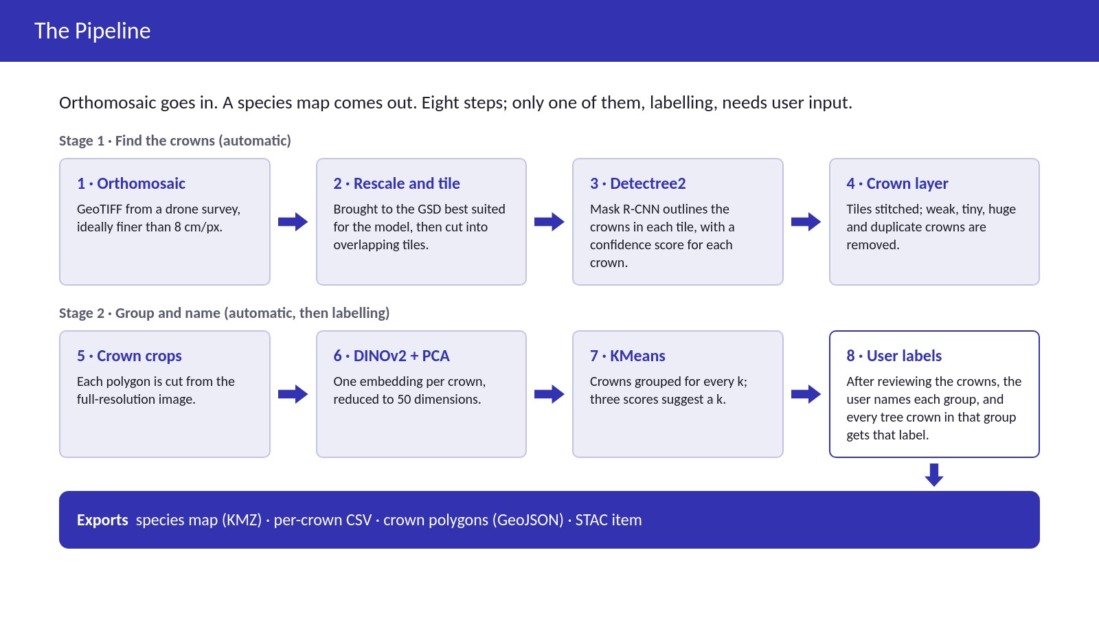
You upload one drone orthomosaic. The tool outlines each tree crown and sorts crowns that look alike into groups. You name each group with a species, then download the result as a map and as tables.
This page has a video of the full process, the project slides, and one complete run shown as nine screenshots. All of it comes from real runs on real imagery.
To see what a particular setting does, use the Parameter Guide.
Four steps. You do the first and the third: choose the image and name the groups. The software does the other two.
8 minutes, with subtitles on screen. Use a chapter button to jump to that part.
The method behind each step: the detector, the settings, the charts and the outputs. Use the buttons, or the arrow keys once the slide is selected.
The name is only for you. The long ID under it is what the software uses: it is the folder on the server where everything from this project is saved. If output sharing is switched on, a Browse output files link appears beside it.
created line. The later steps do not work until it appears.Choose Files opens your computer's file picker. This run used s1_tree.tif. After you pick a file, the card shows its name and size.
If the file is not on this computer, paste a public Google Drive link in the box below and press Fetch from Drive. The server downloads it directly, which is the better way for large files (hundreds of MB).
registered · s1_tree.tif · 11422×13166 px · 4 bands, and the image appears ticked in the list below. Check that the size and band count match your file.The run name can be anything; here it is run 1. After a run finishes you can change the settings and press Run analysis again to start run 2 on the same image. You do not need to upload it again.
Settings used in this run: tile size 20 m with a 15 m buffer, confidence 0.5, up to 6 trees per tile, crown area between 4 and 200 m², full_coverage switched on under Advanced, the default DINOv2 feature extractor, and group counts 2, 4, 6, 8 and 10. With the default settings this image gives 173 trees; with these settings it gives 783. The project slides above show both results side by side.
When the run finishes, the results appear below the button: the Detected crowns picture, three charts that score each group count, and one button per group count. The app's suggestion is marked; here it is four groups.
The app suggested four groups, but this survey only needed to separate acacia from everything else. So we opened k=2 in the review and pressed Use k = 2 and name these groups. This fills in the number here and gives the table one row per group, each starting as unlabelled. The species names you type in the box become the dropdown options for every row.
Look at the sample crowns of each group and choose a species for it. The names go into the downloaded files exactly as typed, so check the spelling.
The app shows the species map, with each crown coloured by the species of its group. Below it are the download links: the KMZ map for Google Earth, the same map as an image, two CSV tables, a STAC metadata file and the crown outlines as GeoJSON.
To start your own run, open the Pipeline tab and begin at step 1. The default settings are a reasonable first try.
If the map looks wrong, the Guide has a table of common problems and the setting to change for each one.